The Secret Language of Style: Colour Psychology in Clothing Explained
In the great theatre of daily life, we all perform — and our costumes, those carefully chosen or accidentally grabbed bits of fabric, do most of the talking before we even open our mouths. That red jumper isn’t just “a nice shade”; it’s a silent declaration of intent. A beige suit can whisper “promotion” just as efficiently as a sequined jacket shouts “don’t expect me to stay long.” Welcome to the curious world of colour psychology in clothing, where science, culture, and vanity hold hands and argue over the mirror.
Every morning we stand before our wardrobes like amateur psychologists about to diagnose ourselves. The question is rarely “what matches?” It’s “what am I trying to say today?” Because colour, whether we admit it or not, is language. And every hue has its dialect, its secret past, its cultural accent.
Let’s start with the obvious show-off — red. Red never whispers. It storms in, tosses its hair, and orders another drink before anyone’s asked. Historically, it was the colour of kings, cardinals, and anyone rich enough to afford crushed cochineal beetles on their robes. In nature, red signals danger, heat, lust — the things that make hearts race and wallets open. In fashion, it’s the go-to shade for confidence (real or faked). The woman in the red dress? She knows exactly what she’s doing. The man in the red tie? He wants you to think he does. Red is dopamine in textile form.
On the opposite side of the emotional spectrum lies blue, the world’s most trusted colour. Blue is the polite handshake of the palette — calm, capable, and slightly distant. When companies want to look reliable, they go blue (think banks and airlines). When you want to appear unflappable, you wear navy. Blue tells people you’ve got your life together, even if your laundry basket says otherwise. But blue has its poetic side too — the melancholy of Picasso’s blue period, the infinite nostalgia of denim. It’s the colour of honesty, but also of longing.
Then there’s black, the drama queen who pretends to be minimalist. Black has dressed everything from beatnik poets to CEOs, mourning widows to goth teens. It’s chic, slimming, and eternally in mourning for something — usually last season’s optimism. Coco Chanel turned it into the uniform of understated elegance; punk turned it into a uniform of rebellion. To wear black is to flirt with seriousness while maintaining plausible deniability. You can be mourning, meditating, or merely matching. It’s the safest risk you’ll ever take.
White, meanwhile, is black’s passive-aggressive twin. Where black conceals, white reveals. It’s the colour of beginnings and of terrifying maintenance. White clothes are aspirational — for people with steady hands, spotless commutes, and no spaghetti sauce in sight. But white is also loaded with symbolism: purity, peace, surrender. In the West, brides wear it to look angelic; in parts of Asia, mourners wear it to honour the dead. So next time you pull on that crisp white shirt, know that you’re participating in centuries of ritual cleanliness — even if you’ll spill coffee on it by noon.
Green is a funny one. It’s nature’s favourite, but fashion’s occasional fling. In medieval Europe, it was the colour of fertility and fairies — both equally unpredictable forces. Later, green became a symbol of envy, and then of sustainability, because nothing says “I recycle” like a sage linen blazer. But green also messes with our eyes; it’s the most restful colour to look at, which explains why so many spas and hospital walls resemble avocado purée. In clothing, green quietly says, “I’m grounded” — though lime or neon versions may add, “and slightly unstable.”
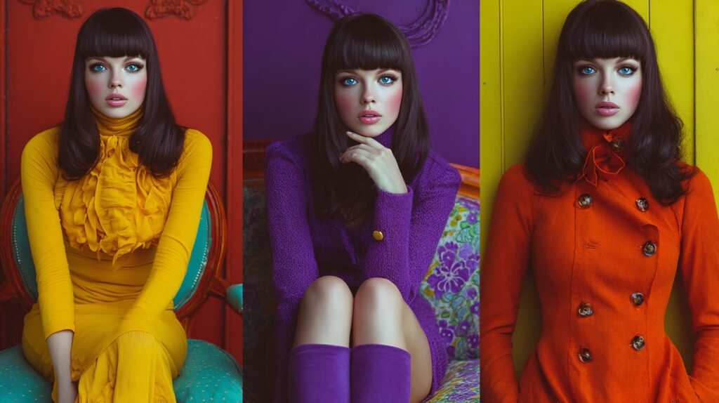
And then there’s yellow. The colour of sunlight, laughter, and the occasional warning sign. Yellow is the hardest hue to pull off — literally and socially. It flatters almost no one, yet radiates optimism like a child’s crayon drawing. Historically, it’s had a complicated PR record: in some eras, associated with betrayal or cowardice; in others, with wisdom and light. In fashion, yellow is for the brave — or the late. You don’t wear it to blend in; you wear it to say, “I’m here, and I forgot my sunglasses.”
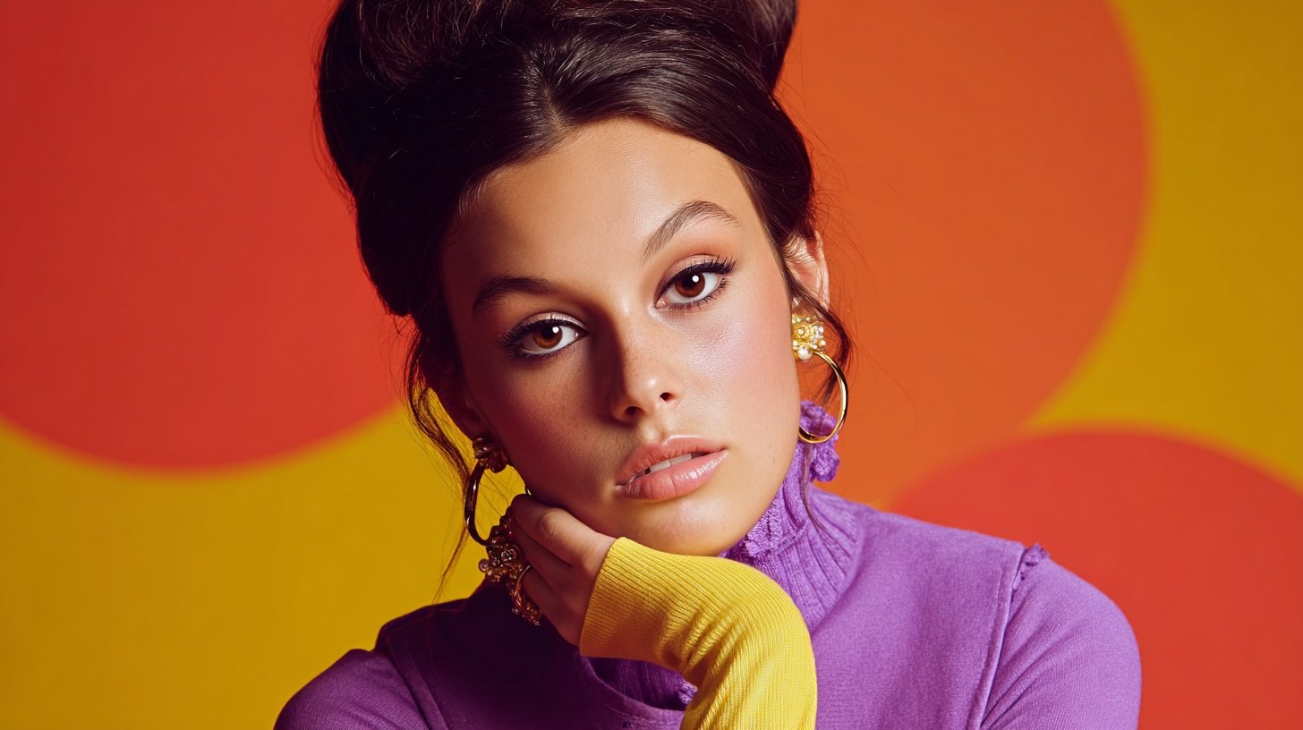
Purple comes wrapped in centuries of snobbery. Once reserved for royalty because the dye was extracted from thousands of molluscs, it still carries an air of “better than you.” The Romans loved it, Elizabeth I banned it for commoners, and Prince turned it into a lifestyle. Purple is for the creative, the mysterious, the ones who quote poetry unironically. Deep violet can feel spiritual; lavender feels nostalgic, like your grandmother’s soap. To wear purple is to admit that you like a little drama with your dignity.
Pink has lived several lives. In the 18th century, it was a colour for boys — energetic, strong, associated with blood and vitality. Then the 20th century flipped the script, thanks to post-war marketing that decided femininity should come in pastel. Decades later, pink fought back. It became ironic, political, subversive. Millennial pink, Barbie pink, punk pink — it’s practically a movement. Wearing pink now means you’re self-aware enough to play with stereotypes and confident enough not to care.
Then there’s brown, forever underrated. It’s the colour of stability, comfort, and espresso. Brown is what happens when bright dreams meet the practicalities of rent. It doesn’t seek attention, which is precisely why it’s chic again. Earth tones speak of mindfulness, sustainability, quiet luxury — the kind that doesn’t shout but hums reassuringly. Brown says, “I’m dependable,” but with better shoes than last year.
Grey, on the other hand, is the diplomat of the wardrobe — neutral, balanced, never offensive. It’s what black wears when it wants a break. But grey’s subtlety is its strength. It’s the backdrop against which colours pop, the unspoken confidence of those who don’t need validation. Still, wear too much and you risk blending into the office carpet. It’s a fine line between “cool understatement” and “forgot I had another jumper.”
And then, of course, there’s orange — fashion’s wildcard. Once the preserve of monks and traffic cones, orange made a surprise comeback as the colour of bold optimism. It’s warm, it’s loud, and it photographs like a dream. In clothing, it’s an extrovert’s handshake, a colour that insists on participation. Wear it to brunch and you’ll get compliments; wear it to a board meeting and you’ll get questions.
Every colour has a psychological footprint. The reason they affect us isn’t mystical — it’s biological and cultural. Our brains evolved to respond to colour as information: red means ripe fruit or danger, blue means distance or calm, green means safety. Over centuries, cultures layered meanings onto these instincts, turning survival cues into fashion codes. The result: a complex, often contradictory dictionary of hue and mood.
Take black and white, for instance — opposites that often mean the same thing: sophistication. A black tuxedo and a white shirt both suggest formality, but in different accents. Or consider how red means love in one culture, mourning in another. Blue can symbolise sadness in English, but immortality in Chinese tradition. When we talk about colour psychology in clothing, we’re really talking about a cultural conversation with ourselves. We wear what we hope others will interpret correctly.
Marketing, of course, knows all this. Retailers spend fortunes studying which shades make people open their wallets faster. Fast-fashion chains flood stores with bright colours in spring to trigger optimism; luxury brands prefer muted palettes that whisper exclusivity. Ever noticed how luxury boutiques are filled with beige, taupe, and dusty rose? They don’t want excitement; they want calm, because calm people spend more. Meanwhile, sportswear brands scream in neons because they want you to feel alive — and maybe buy a matching water bottle.
But beyond strategy, colour is intimacy. Think of how a certain shade can time-travel you. A particular green might remind you of your school uniform, a red scarf of a first date, a navy coat of a city you once loved. Fashion psychologists call it chromatic memory: colours link to emotion faster than words. That’s why we reach for “lucky” shirts or “comfort” jumpers — they hold emotional charge, not just fabric softener.
There’s also the social dance of colour. In a group photo, notice who stands out: usually the one who understands contrast. Wear bright yellow at a wedding, and you’ve effectively written your own headline. Opt for muted tones at a gallery opening, and you look like you belong to the art. We read colour subconsciously, assigning roles: the romantic in pink, the leader in navy, the rebel in black. It’s collective storytelling through fabric.
And yet, colour meaning isn’t static. It evolves with our politics, our pop culture, our collective mood swings. Once upon a time, pink meant domesticity; now it’s protest. Black once meant grief; now it’s empowerment. Even green has gone from envy to eco-consciousness. The palette shifts as society does. Fashion, at its core, is just the art of dressing for the zeitgeist.
Of course, some people claim to be “colour blind” in style — loyal only to monochrome wardrobes. The minimalists of Instagram built an empire out of beige. There’s something soothing about simplicity, but even that’s a colour statement: neutrality as rebellion against chaos. In a loud world, beige whispers luxury. That whisper costs £600 a cardigan, but still — a whisper.
So what’s the takeaway from this unscientific but emotionally accurate survey of our chromatic habits? That clothes are the most accessible form of self-expression we own. You don’t need a gallery wall or a microphone; just a good shirt in the right hue. Your colour choices tell the world how you want to feel, not just how you want to look. Wear red when you need courage. Wear blue when you need calm. And, wear yellow when you want to risk joy. And when all else fails, wear black — it never argues back.
In the end, colour psychology in clothing isn’t about rules or right answers. It’s about awareness — of what you project, what you suppress, and what you accidentally reveal when you grab that jumper in the half-light. It’s about using colour as a vocabulary for days when words are too slow. We might not be able to control what life throws at us, but we can absolutely choose the shade we throw back.
Because style isn’t just what we wear — it’s what we mean when we wear it.